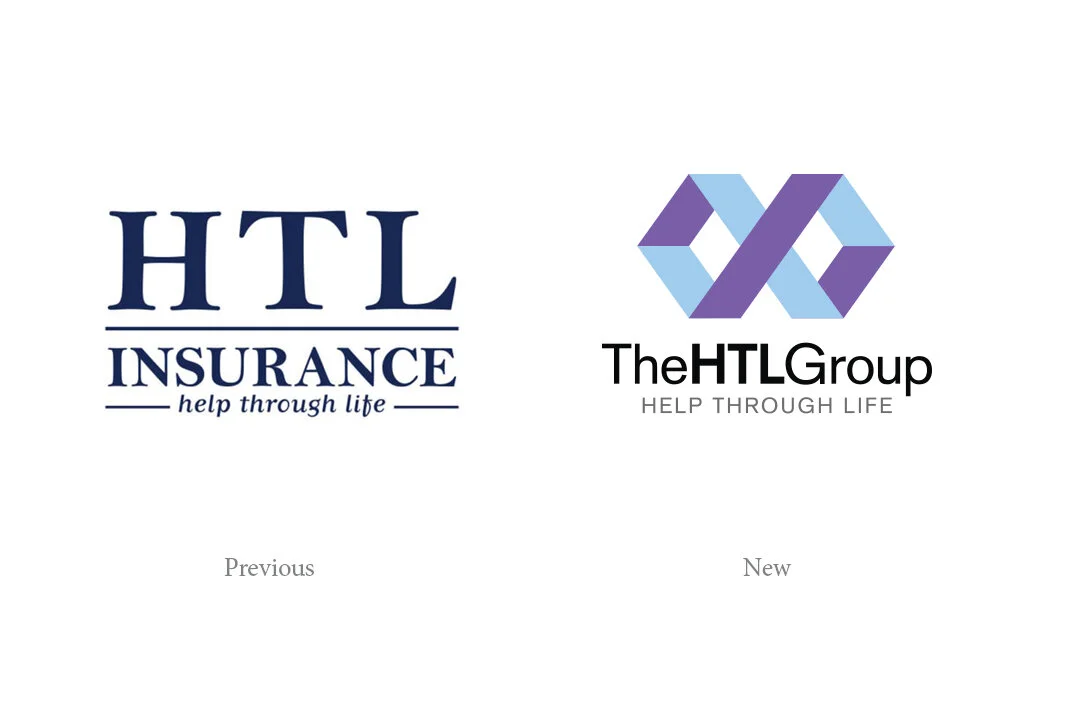
A symbolic icon and unique colour theme representing infinite relationships, wealth and trust.
HTL Insurance approached The Brand Depot with a proposal to rebrand their business under their new name: The HTL Group. We provided a concept that used a brand icon based on the infinity symbol to represent The HTL Group's never ending relationship with their clients through all stages of life. Purple (symbolising wealth) and light blue (symbolising trust) were chosen as their brand colour combination and clearly differentiates The HTL Group from their competitors in the financial services sector. The company’s new branding won the 2020 Taranaki Chamber Brand and Marketing Business Excellence award.
SCOPE: BRAND STRATEGY, BRAND IDENTITY, BRAND GUIDELINES